foundation
PURPOSE
Presentation of the design view regarding the sub-packages of web-reactive-frontend project since its src folder.
DESIGN VIEW
The technical description regarding behavior and best usage is maintained into the Javadoc of each component.
| Component Type | Motivation | |
|---|---|---|
| App | Application view including the global configuration of a React JS single-page web application including viewport sub-elements | |
| CompositeScreen | React component assembling several display components with presentational components that defined a CYBNITY cockpit’s screen (e.g perspective) | |
| ContainerComponent | Stateful React component that manage a screen state changes (e.g client-side data with reducer() functions), the data to render and the behavior logical of a screen; listener of presentational components’ actions published in store and managed as events of immutable state values | |
| DataStore | Client-side data provider managing data states regarding one (e.g display view) or several contexts (e.g composite screen sharing data between multiple sub-elements of presentation); configuration of data link to reduce component references (container component references) in a low coupling approach; local data store managing data (e.g local shared data between presentation and control elements) or read model of remote data provider(s) | |
| DisplayComponent | View component that control the behavior of sub-components (e.g perspective internal views; sub-elements of a screen) and presentational sub-elements (e.g buttons); ensure rendering of the presentation components; manage low coupling between a container and it’s presentational components | |
| EventBus | Backend proxy (e.g in/out channels bus) allowing interactions with remote data layer (e.g server-side services provided as domain capabilities) to dispatch user’s change intents (e.g command events) and/or to receive remote data layer changed status (e.g collect of data status to upgrade into a client-side data store) | |
| RenderingComponent | Stateless React function which ensure the HTML rendering into a web browser, and that ensure push of intent events (e.g as actions) to store (e.g over changes into the linked Store through assigned ContainerComponent); it’s an eligible element to composite instantiation |
%%{
  init: {
    'theme': 'base',
    'themeVariables': {
        'background': '#ffffff',
        'fontFamily': 'arial',
        'fontSize': '18px',
        'primaryColor': '#fff',
        'primaryBorderColor': '#0e2a43',
        'secondaryBorderColor': '#0e2a43',
        'tertiaryBorderColor': '#0e2a43',
        'edgeLabelBackground':'#0e2a43',
        'lineColor': '#0e2a43',
        'tertiaryColor': '#fff'
    }
  }
}%%
classDiagram
    App *-- "1" CompositeScreen :commandCockpit
    App *-- "1" DataStore :localDataStore
    CompositeScreen ..> "*" RenderingComponent :assemblablePresentationalComponents
    CompositeScreen ..> "*" DisplayComponent :assemblableCouplingManagersOfLinkableControllers
    DisplayComponent *-- "1..*" RenderingComponent :uiRenderingElements
    RenderingComponent --> "1.*" ContainerComponent :uiDataControlLayer
    RenderingComponent *-- "0..*" RenderingComponent :uiSubElements
    ContainerComponent ..> "1" DataStore :uiDataLayer
    ContainerComponent --> "1" EventBus :backendChannelsGateway

    class App {
        <<Reactive App>>
    }
    class DisplayComponent {
        <<React Component>>
    }
    class ContainerComponent {
        <<React Component>>
    }
    class CompositeScreen {
        <<React Function>>
    }
    class RenderingComponent {
        <<React Function>>
    }
    class DataStore {
        <<interface>>
        +getState() Object
        +dispatch(Event)
        +subscribe(ContainerComponent listener)
        +unsubscribe(ContainerComponent observer)
    }
    class EventBus {
        <<interface>>
    }
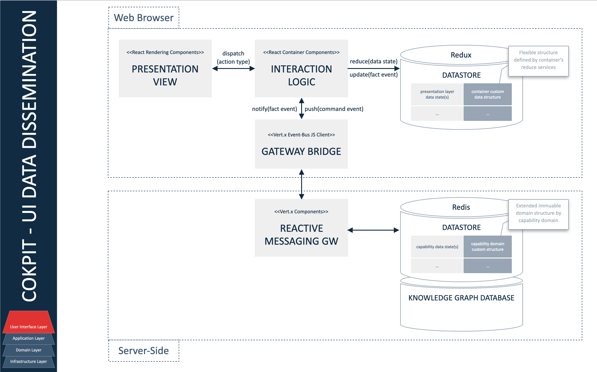
IMPLEMENTATION STRUCTURE MODELS
Several packages are implemented to organize the components (e.g specification elements, implementation components) required by each application module (e.g according to its application domain).
React Redux library is reused as implementation model of client-side data layer.
The Redux Toolkit is used as recommended in place of legacy using of redux core package.
Developer documentation can be use as support for implementation.
COMPONENTS PACKAGE
Several types of common reactive elements are defined included as enabler and utilities components which are reusable into any feature module. The sub-packages are organized by type of components.
| Component Type | Motivation |
|---|---|
| DynamicStandaloneInformationScreen | Composite screen that allow to show a dedicated and autonomous information type |
Security sub-package
Include components used in secured area.
| Component Type | Motivation |
|---|---|
Services sub-package
| Component Type | Motivation |
|---|---|
| DataStore | Local datastore supporting visual capabilities |
Data dissemination
FEATURES PACKAGE
The sub-packages are organized by capability/feature module.
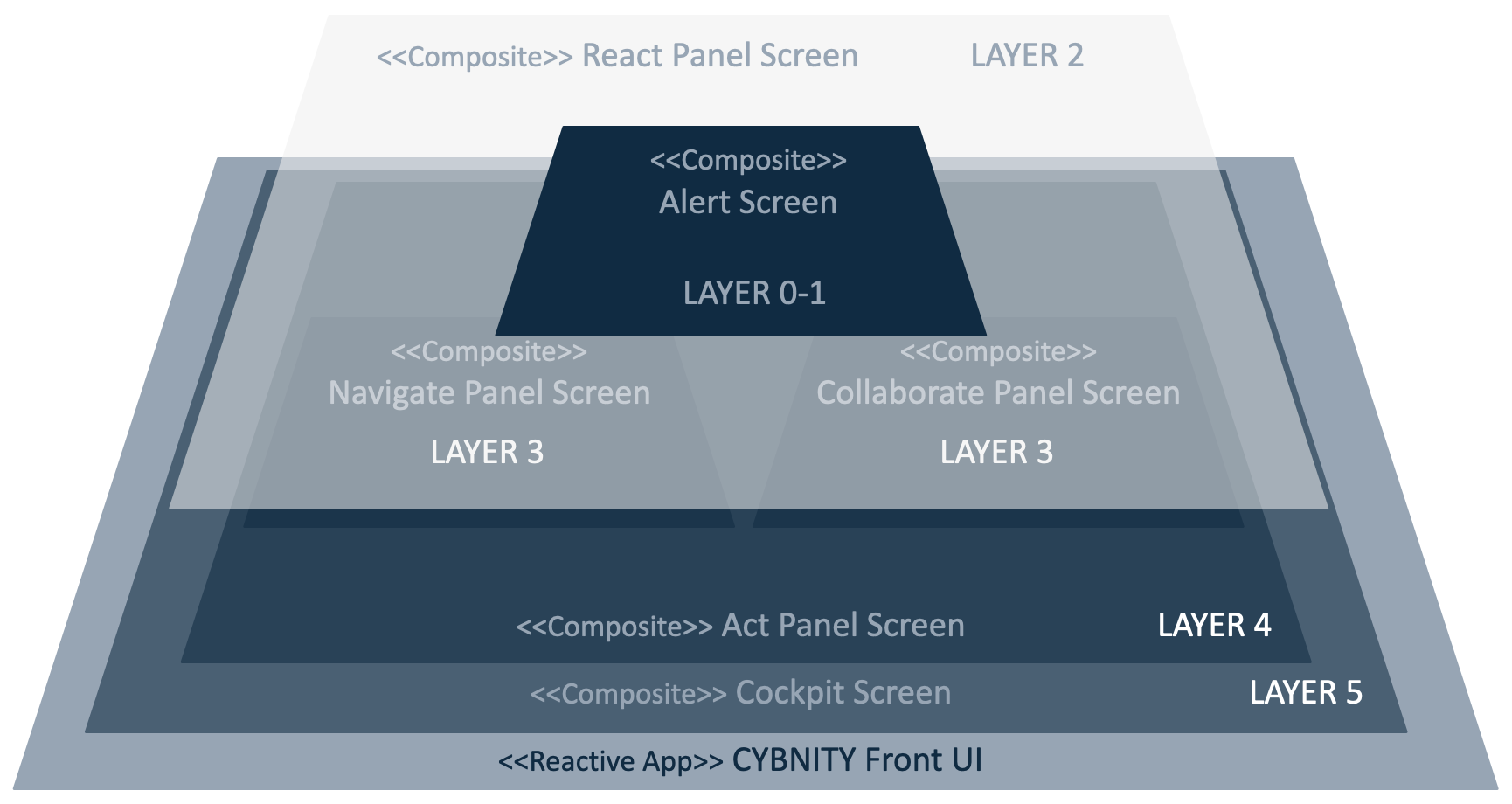
Cockpits sub-package
Include cockpit composite elements and sub-elements defining systems of operational cockpits. See concept documentation for more detail.
| Component Type | Motivation |
|---|---|
| ActPanelScreenDisplay | Information or process management view (e.g actions plan, asset detail) |
| AlertScreenDisplay | Alerting view (e.g urgent decision modal view) suspending user’s current activity for immediate action(s) |
| CockpitScreen | Dynamic configured composite screen materializing the user cockpit according to his organization role and to the current organization’s Infocon level |
| CollaboratePanelScreenDisplay | Instant collaboration panel (e.g group chat, team video live) with other team members |
| InfoconCockpitScreenContainer | 5-Operational performance monitoring cockpit; 4-Risk of attack operational cockpit; 3-Increased alertness & security review cockpit; 2-Ready to cyber fight cockpit; 1-Offensive immediate response cockpit |
| NavigateScreenDisplay | Search view of information, missions, topics and sections of contents (e.g user’s role/mission based) allowing to navigate into ISMS |
| ReactPanelScreenDisplay | Urgency actions command panel (e.g team mobilization, intercom, BCP/DRP start) |
| SituationPanelScreenDisplay | Environment metrics and situation indicators panel (e.g asset status, risk level, intervention team status) according to a time range zoom |
%%{
  init: {
    'theme': 'base',
    'themeVariables': {
        'background': '#ffffff',
        'fontFamily': 'arial',
        'fontSize': '18px',
        'primaryColor': '#fff',
        'primaryBorderColor': '#0e2a43',
        'secondaryBorderColor': '#0e2a43',
        'tertiaryBorderColor': '#0e2a43',
        'edgeLabelBackground':'#0e2a43',
        'lineColor': '#0e2a43',
        'tertiaryColor': '#fff'
    }
  }
}%%
classDiagram
    CollaboratePanelScreenDisplay ..> "0..*" AlertScreenDisplay
    ActPanelScreenDisplay *-- "1" NavigateScreenDisplay :navigate
    ActPanelScreenDisplay ..> "0..*" AlertScreenDisplay
    ActPanelScreenDisplay o-- "1" CollaboratePanelScreenDisplay :collaborate
    ActPanelScreenDisplay "1..*" <-- UserContextContainer :act
    UserContextContainer ..> "0..*" AlertScreenDisplay
    CockpitScreen --> "1..*" ActPanelScreenDisplay :manage
    ReactPanelScreenDisplay ..> "0..*" AlertScreenDisplay
    SituationPanelScreenDisplay ..> "0..*" AlertScreenDisplay
    CockpitScreen "1" ..> "0..1" UserContextContainer :activeScreenManager

    class UserContextContainer {
        <<ContainerComponent>>
    }
    class ReactPanelScreenDisplay {
        <<DisplayComponent>>
    }
    class SituationPanelScreenDisplay {
        <<DisplayComponent>>
        -reactView : ReactPanelScreenDisplay
    }
    class ActPanelScreenDisplay {
        <<DisplayComponent>>
    }
    class NavigateScreenDisplay {
        <<DisplayComponent>>
    }
    class AlertScreenDisplay {
        <<DisplayComponent>>
    }
    class CollaboratePanelScreenDisplay {
        <<DisplayComponent>>
    }
    class CockpitScreen {
        <<CompositeScreen>>
        -reactView : ReactPanelScreenDisplay
        -collaborateView : CollaboratePanelScreenDisplay
    }
Access-control sub-package
Capability providers required by the UI layer of the access-control domain module.
| Component Type | Motivation |
|---|---|
| AccountRegistrationViewRendering | Presentation layer of new organization name registration form |
| AccountRegistrationContainer | Reducer managing interactions layer regarding the tenant registration view |